
ART FUND: WEBSITE REDESIGN
Role: Creative director


Brief
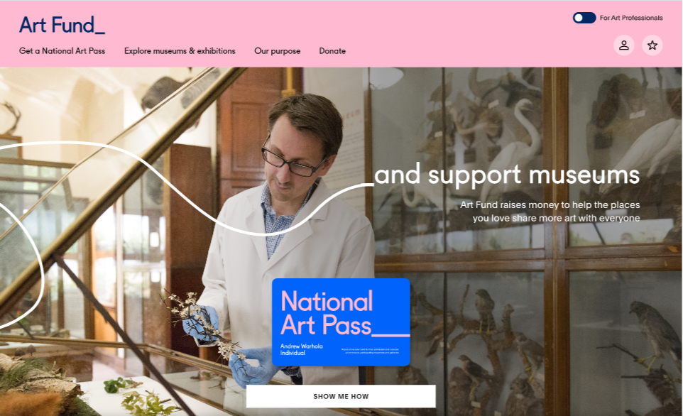
Art Fund’s website was reskinned during the 2016 rebrand project, however five years later the design was feeling tired and out of alignment with the brand, with confusing navigation and too much out-of-date content. The challenge was to deliver optimised customer journeys, to increase traffic and online sales for Art Fund’s two key audience segments: museum professionals looking to get funding and consumer audiences wanting to buy a National Art Pass and get visiting recommendations, while still feeling like one unified user experience.
Process
Working with MullenLowe Profero’s UX and UI teams to first identify a set of ‘golden journeys’ that we wanted visitors to make on the site. I then worked on the visual language for each journey in a series of sprints, to make sure the new designs captured the spirit of Art Fund’s brand while also adapting to the requirements of each audience group.
Agency: MullenLowe Profero
Result
A vibrant and responsive website that spoke to both audiences, with a new homepage and clearer navigation and fully aligned to the brand which increased visitor engagement, online sales and email sign-up. We added larger hero images to all landing pages that showed a diverse range of people engaging with art and museums in a fun and dynamic way and cleverly using Art Fund’s brand motion styles throughout the site also added excitement and engagement during key moments in the sales funnel.